Painting a Common Scenery in Watercolor – Easy watercolor ideas

Step by Step watercolor painting -Easy watercolor ideas

Hi everyone,
This post is a step by step watercolor painting from the series, easy watercolor ideas. the topic is a common scenery, the entrance of a home. I am so excited to share with you this post, if you have been following me, I am glad that you are back. And, if you are new to this blog, welcome!

The easy watercolor idea of today is presented in a step by step process that you can follow easily. This type of project provides you the satisfaction to create something new from an common view (scenery).

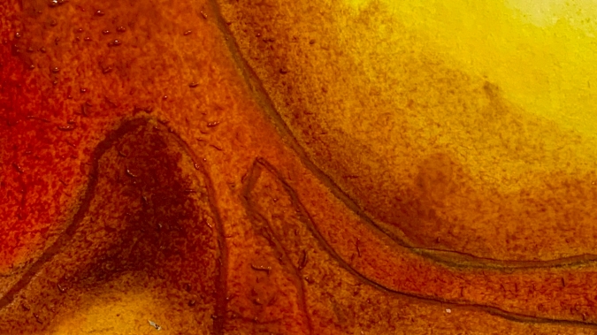
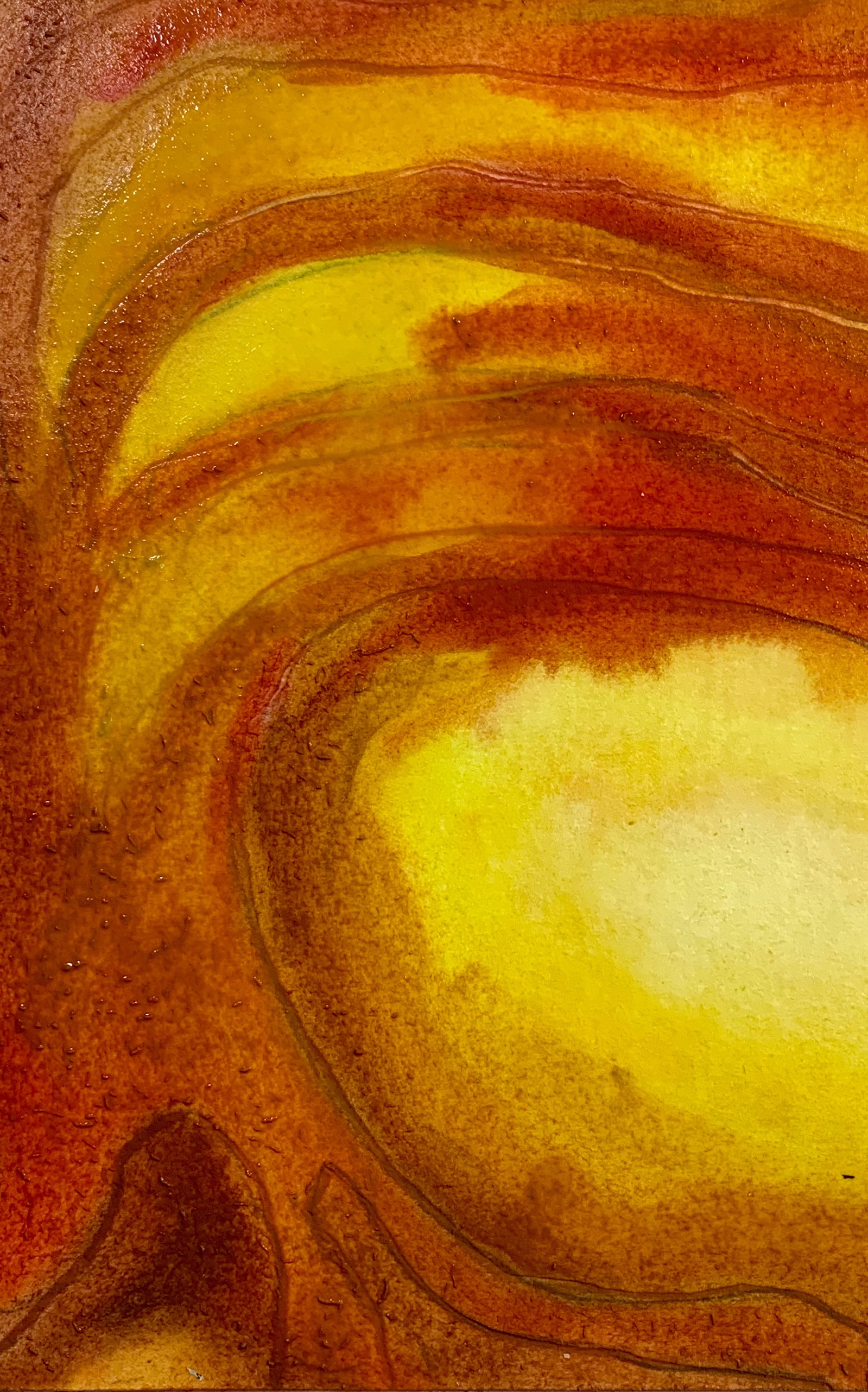
On the other hand, I want you to know that I did not use a picture as reference, I drew it, and painted from memory. It is a good idea to try that, just imagining a scene, put the idea in paper, and paint it with watercolors. As you can see in my website front page, very much all of my works are from memory. Check other works by me here. But overall, you need direction, which can come from step by step painting.

In the content of easy watercolor ideas: what are the benefits of painting a ‘common scenery’ in watercolor?

Continuing with the idea of painting a common scenery, or, common topic. I would like to say that painting a common scenery is not complicated as other topics, in terms of light, and shadows. Also, with this type of subject the colors can be limited. So, painting with a limited palette is always helpful especially if you are new to watercolor painting. For example, you can paint the door in red.

I painted the door in blue to make it contrast with the yellows in the home’s walls. But if the walls were white, a red, or, a dark brown probably works just fine as the color for the door. See where my point is? A simple, and common scenery can help you to gain confidence in how to distribute color, and assign values in your watercolor painting.

More examples of watercolor simple ideas…

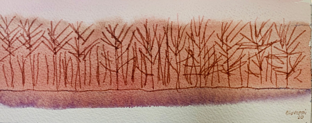
In a post of several weeks ago, I painted another simple idea, this idea is very simple, three lines, sky, the horizon, and the water in the lake. Check this out here, and you can use it as another example of painting common topics in a simple way.

Completing the painting…

I would like to do two things, first, I will give you some simple steps on how to succeed in your watercolor painting. And, secondly, I would demonstrate you how I did it, which can be seen in the video clip later in the post.

More watercolor simple ideas: adding color to the painting in three steps…

Now, it is time to watch the videoclip that demonstrates how I completed the painting. There are some points I want to call your attention – so, you can learn from me, or, just enjoy it better. What follows are the main steps in the process:

1. Start with a color that you like.
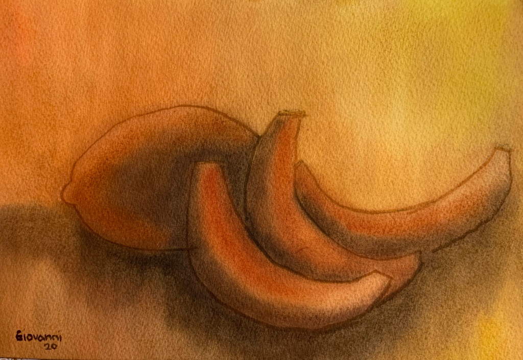
I started with yellow, not only because I love yellows but it happens to be that I was trying to reproduce an image from my mind of a yellow wall as one of my sister’s house.

2. Choose a color that is complementary, or, contrasting to the main object in the painting. In my case, I chose blue for the door to make more contrast with the colors.

3. Add a color that brings the eye of the viewer to another point in the painting. In my case, this color is the red in the flowers (at front) helps to make a balance in the painting, and it also helps to rest the eyes of the viewer.

And, don’t forget the paper, watercolor paper comes in all varieties, but it is important that you chose a paper that can hold well a lot of water, and that is resistant to scratch. I had discussed this important point in a series of early post. You can check some of them here.


Here is the videoclip for you to enjoy it… it is also available in YouTube Videoclip of By the Door/Entrada (de la casa)

Videoclip of By the Door/Entrada (de la casa)

Here is the finished painting

Now, you can enjoy the picture that shows the full composition below:

easywatercolorideas-painting a common scenery. "By the Door "watercolor painting.
Painting of By the Door watercolor on paper 2020

The take home from todays …

Finally, There is no a bad topic, or, simple subject to paint. It is all about fun, and making something common, and simple to become great! As you could see about the painting in this post, now, a common scenery became art.

And, don’t forget the paper, watercolor paper comes in all varieties, but it is important that you chose a paper that can hold well a lot of water, and that is resistant to scratch. I had discussed this important point in a series of early post. You can check some of them here.

Painting in watercolor a rare tropical fruit (zapote)

Easy ideas in watercolor

Hello again!
For this new post, I would like to show how I chose a topic of a rare fruit that grows mainly in tropical countries; its name is ‘zapote’. It grows in a tall tree, and it is called with the same name, zapote tree. This is not the first time I painted a zapote fruit, I had shared already another painting on the same topic. Check it here. The difference now is this time, the zapote fruit is part of a composition, and that is the reason I called, still life with zapote.

What is this cool, and easy watercolor idea?

I painted this rare fruit, because of its inside color. On the outside it resembles kiwi fruit (a dull color), but as the kiwi is another color inside, this fruit (zapote) has beautiful colors inside, especially oranges in different hues. It is gorgeous.

I did a Google search about zapote, and found beautiful pictures. I used the name zapote, but this fruit is called ‘mamey’ in other countries in Latin America and the Caribbean. Again, I painted because of its colors.

You may ask yourself, the painting is not only about the zapote fruit, it is also a still life with more elements. This is true, I just became fascinated by the zapote tree. So, now, I will start talking about the still life itself in the next paragraphs.

Easy painting ideas: painting a still life with zapote

The first thing I considered for the composition is what color the rest of the elements in the painting would contrast better. Especially for the oranges hues in the painting, I though that blue fits well. Secondly, what elements to add, my favorites, cups of coffee, and a pitchel with water.

On the back of the composition, you can see a basket with zapotes. It looks like bread, but they are zapotes.

The following video clip that is also posted in YouTube present how this watercolor painting was completed:

Video clip of Still life with zapote

The finished painting

Now, you can enjoy the picture that shows the full composition below:

Still life with zapote
Still life with zapote is a watercolor that includes this unique tropical fruit, zapote, which resembles a canteloupe but tastes completely different.

What can you learn from this painting…

I you are interested in painting with watercolors, this painting can show you some simple steps:
1. Use contrasting colors in the elements, for example, the yellow in the orange of complementary to the oranges (in the zapote fruit), and yellows/oranges in the fruit are contrasting with the blue of the cups, and water container.
2. For the shadows instead of using grays, use purple. And, for the background, you can use similar colors to the fruit’s color.

In summary, try to copy from me, and follow my recommendations on how to choose the colors in the composition. If you don’t feel confident to work in the full composition, try separately to work (draw and color) some of the elements, for example, the cups; or, the water container (pitcher). Hope you will try!

Painting in a simple way: painting a tree in watercolor

Easy ideas in watercolor

Hello everyone!
I am back to share with you a new easy watercolor idea. It is easy in the sense that you feel that you can do it. That is the idea of today’s post; to work on something cool that at the same time is creative. For this post, I want to share with you one of these ideas, painting a tree. Although painting a tree is not always simple, nor, easy; there are always way to do it without major complication. Please feel free to do it as you can, or, a as you want. The key is that it is easy, and not complicated. So, you can have fun doing it.

What is this cool, and easy watercolor idea?

Continuing with the idea above, the purpose of the project is to paint a tree using watercolors. What I prepared for this post, is the painting of a red tree known as Acacia (or, ‘Llama del Bosque’ in Spanish/direct translation: ‘Fire of the Forest.) This tropical tree can be seen in the Caribbean, Mexico, Central America and other Latin American countries. You can find lots of pictures about this tree. I did a google search and found a lot picture that make my point. Check this here.

Painting a tree is always fun, why? It is because since we are children, we like to draw trees. So, painting trees is not intimidating. And, if the tree is red as the case of the acacia tree, then, the idea of painting a tree became more fun!

Easy painting ideas: Painting a tree

When painting a tree, one of the main elements is to think on the foliage, how do I convey the idea of the leaves. And, also, do make the trunk to appear realistic, and not fake, or, plasticized? In this example shown before, both of the problems were solved by using bright colors, and a combination of browns, purples, and reds with lots of yellow.

Compared this tree to other trees…

Also by following my posts, you probably had noted that this is not the first time, I showed how to paint a tree – or, how I painted my trees. See other example of different trees that I have shared in previous post of this blog.

Not all trees are the same, and that is the beauty of painting. You can paint the same idea in different ways. As someone said: “a tree is always a tree,” and it is the topic of so many painting workshops that people these days do for fun. For example, this glowing tree.

In previous post, I also shared certain ‘type’ of trees that have a very particular style. The main characteristic is the circled branches. Check this out at another previous post.

Now, let’s see how I painted a red tree

The video clip that is available here is also posted in YouTube Below you can see the video from here:video clip of Acacia tree

Video clip of Acacia Tree

A picture of the finished painting

A full picture of the finished painting is presented below. See how the red in the foliage gives the idea of leaves, and it is not flat. How I did that? I did by applying several layers of reds (mainly Crimson and Cadmium), and orange (I chose an orange that is closer to a red, but a little more intense that a yellow pigment). The combination of reds and oranges make the foliage colorful, and intense.

Easy painting ideas. Painting a tree. The Acacia tree, or, red tree.
Acacia tree – watercolor on paper 2020

Now, let’s summarize how it was done…

I worked first on the background, laying first the colors that are more transparent – in this manner, it is will be easier to work on some transparencies later. Once the lighter, and transparent colors were applied, I started by working on the darker tones, including the reds on the top of the tree. Followed by using a mix of blue, red, and brown on the tree trunk. Then I went back, and also apply a soft layer of purple on the soil, and let the yellow show on the top.

Your opinion

Let me know what you think about the whole project of painting a simple idea, in this case, a tree.

New Ideas: Painting a topic that means another

Easy Painting Watercolor Ideas

Hello every one,
If you have been following my blog, you probably had noted that for the most part, what you see in the painting, is what I am trying to depict. But in this post, I am sharing with you something that you see but the meaning is another. Let me explain myself better, the painting is a watercolor that presents human eyes, from different colors; but what I really want to communicate is that every eye [in the painting] represents a different ethnic group. So, I called the painting: Diversity.

Below is the video clip of it:

Video clip of the watercolor painting, Diversity

Now, see full picture of it below.

Diversity – Watercolor on paper 2020

I worked on the painting use the back of the paint brush as a pencil. To get the effect, the lines need to be done while the paper is wet. I also created the white spots around the eyes by using a piece of tissue to remove the pigment on the wet paper. What do you think? How do you like it?

Two Old Ideas – a tree and a woman selling fruit

Easy Painting Watercolor Ideas

Hi,
In this post I want to share with you two of my old favorites, painting the same tree over and over, and another about a woman selling fruit (I have seen this image in Latin America all my life). I had painted several times the same topic, but these two paintings presented here are recently done. And every time, I paint the same topic, I try to add something new, and improve my watercolor techniques.

Let’s look at the first of the mentioned paintings, “The Famous tree.” The video clip of how I did the work is presented below.

Videoclip of the Famous Tree

I called, the ‘famous’ tree because it is ‘famous’ for me, this idea (image) has been with me for years, and years. And, although there are several similar images in the web, I assure you that this is original, it is my own creation. See full picture of it below.

Famous Tree – Watercolor on paper 2020

Next, the woman selling fruit. There are two particular features that can be seen in this painting, one, is to show how some people sell fruit in market places in Latin America (carrying the product on the top of their heads). And two, the arrangement of the painting is simple, and the details were done with the back of the paintbrush while the paper was wet. See vidoe clip of it below.

Video Clip of Selling Fruit

A picture of the completed project is presented below:

Selling Fruit – Watercolor on paper 2020

As I mentioned in other posts in this blog, the fine lines around the image of the woman, and the basket of fruit was done using the back of the paintbrush. The wood part of the paintbrush can be sharpen with a knife, and use it as a pencil. Also, if you want to try this technique, please don’t forget that the paper needs to be a paper that holds a lot of water, and that is resistant to scratch. Work on the lines with the mentioned technique while the paper is wet, otherwise, you will not be able to capture the effect.

Hope you enjoy it!

Working with shades (also called Silhouettes)

Hi,
I hope you have been following me (with my posts), and seen that there is a sequence of techniques I have been demonstrating through these communications. I called, the series, New Themes because if covers different subject topics.

Here I will share with you two paintings that are very similar in the way the subject area or, topic has been treated/managed: using the shadows of the forms to emphasize the movements. The key here also is to choose a background that offers a lot of contrast, so, the image looks darker.

Video clip of Movements

In the picture that follows, I am sharing with you the final results. What do you think? I hope you liked!

Movements – watercolor on paper 2020

As you could see it above, the details of the person were done using the back of the paintbrush while the paper was wet.

Video clip of Silhouttes

The complete image of the painting is presented below:

Silhouttes – watercolor on paper 2020

In both paintings, some of pencil lines are left intentionally but it is clearer in the painting above.

Finally, I hope you had enjoyed the post. Let me know if you have any questions, or, want to know more about how the paintings in this post were completed.

New Themes-Series – Watercolor painting

Hi, for this post, I want to share with you two painting from what I called, ‘New themes/Series,’ which have this name because new ideas were used for their creation. Does it happen to you that, sometimes a new idea for a painting/project comes to your mine, but you are unsure if it is a good idea; then, you put the idea in the paper, and the results are great! That’s what I think of these two paintings, the first is tree and the second is a garden plant.


The first painting is a watercolor about a tree moved by the wind, the idea here is that the wind is hitting hard the tree at the point that the tree almost breaks, but since the tree bends instead, then, the tree stands. Somebody toll me that when we don’t bend, we can break, or, be broken by the wind of life. So, that is the lesson behind this painting. See the video below, and then, the complete picture of it.

Tree moved by the Wind – Video Clip

See below the completed work:

Tree moved by the Wind – Watercolor on paper 2020

The second painting is a garden plant that is commonly found in Latin America, but now, it can be seen also in some gardens in the United States, its name is Bleeding Heart. The names comes from the fact that the leaves seems to bleed (in a figurative way). See video of the completed work below, followed by a picture of the painting.

Bleeding Hearts video clip

See picture of the completed painting below.

Bleeding Heart/Corazón Sangriento (Spanish) – watercolor on paper 2020

Now, tell me what you think, do you like it? Do you see something interesting on any of the paintings presented in this post? Please let me know. Thanks.

Watercolor painting – Exploring other techniques

Hi,
Since last post, I have been thinking what to show you for this week. And, I decided to continue on the technique I mentioned last week, using the back of the paintbrush to re-draw (make the remarks) the subject/topic of the painting.

Let’s look at the materials I used:

The paper, be sure that you use a paper that is resistant to scratch, and holds a lot of water without forming buckles, or, bending. For this projects presented in this post, I used the Arches (brand) watercolor paper.
Watercolors. I used the Arteza (brand) watercolors, which comes with a great variety of colors, and the price is very accessible.
Paintbrush. For this type of project, there is no need to find an expensive paintbrush, on the contrary, a cheaper one is better because the back of it will be used to draw (instead of a pencil).
A quick review of the technique:
First, draw your subject/topic as you regularly do; wet the watercolor paper very well (with abundant water), after that, start painting by adding some layers of watercolor’s pigment with the paintbrush, and while the paper is still wet, use the back of the paintbrush to re-draw (make remarks) of your composition.

Painting one: Zapotes (a tropical fruit that looks very similar to melon, but that taste different).
Below is a video clip of the first project in which I am demonstrating the mentioned technique.

Video Clip of Zapotes watercolor on paper

As the video shows, the first step is (while the paper is very wet), the layers of color are added, then, over these layers, the draw is done using the back of the paintbrush. Finish the details with mostly wet, or, dry brushstrokes of colors.

Below a full picture of the completed painting:

Zapotes watercolor on paper 2020

Second Painting: Tomatoes. The video clip below show in a time lapse video how the painting was completed:

Video clip of Tomatoes in blue container

Again, while the paper is very wet – it has to be very wet in order to allow you to draw with the back (stick) of the paintbrush.

And, the picture of the completed painting.

Tomatoes in blue container – watercolor on paper 2020

As you can see it, the technique discussed in this post give you good results. It is very important to have in mind what you are planning to draw, because as you saw it (in the video clips), you start with a drawing of the subject/topic, but then, the layers of colors and the wet paper makes the lines to almost disappear; but that is the purpose of re-drawing the subject/topic, to make remarks, and add another touch to your watercolor paintings. Hope you like it!

Painting a little different using a lot of water – watercolor painting new series

Hi, as I did in my last week post, I am doing something a little different – compared to most of my previous posts. First, I want to start by providing some background information about the topic of the work/painting presented here. And, secondly, I will show you more than one painting in the post.

Background information:

The paper, for this project I used the Arches (this is the brand of watercolor paper). As you will note in this picture, this time I am using the orange (color of the paper varies by type, this orange is rough) below:

Orange cover Arches paper
Orange cover in the Arches brand is rough

As mentioned in previous post, this brand Arches paper (orange’s cover) above – is very resistant to scratch, and holds a lot of water without bending, and that is the main reason, I am using it for this project. Keep in mind that the Arches paper comes in different sizes, and for each category (especially, the type of texture) there is different color in the cover page.

Additional materials:
Watercolors. For this project I used the Winsord and Newton brand packed into squeezable containers, or, tubes. I used them because they are fluid, and the pigment can be applied directly in the paper – more easily than ‘tablet’ watercolors. See below a picture of these watercolor’s brand:

Winsor & Newton Professional Watercolor Paint Tubes
Windsor & Newton watercolors

Pencils: any 2HB pencil can work fine, I prefer to use blue color pencil, so, the lines mix with the watercolor pigments later in the process. But any pencil can also work, especially a pencil that is a drawing pencil type. See below a picture of the brand that I use, but again, you don’t need a specific brand if you cannot afford a little costly brand.

Faber-Castell 9000 Pencil Set - Drawing Set, Set of 6
2HB pencils work better (in my opinion)

Paintbrush. For this project, any good paintbrush can be used. Compared to previous project, this time, we are not using the back of it to draw, this time, we are using a pencil.

Procedure: draw your subject, use a lot of water to complete the painting. After the first layers of watercolor are dry, add another layer of dried watercolor pigment to work on the details. To dry the paper faster, I use a hairdryer, but you can also wait another time/day to complete the project, letting the paper dries by itself, or, naturally.

Project one: The Lake
Below is a video clip of the first project in which I am demonstrating some of the major steps I used used to completed the painting.

Video clip of the Lake -watercolor on paper

Below a full picture of the completed painting:

The Lake – Watercolor on paper 2020

Second project: Hello! The video clip below show in a time lapse video how the painting was completed:

Video clip of Hello!

And, the picture of the completed painting.

Hello! – Watercolor on paper 2020

Third project of this series: Bleeding Hearts (Plant). The process for this work can be seen in the video clip below:

Video clip of Bleeding Hearts (Plant)

Now, see a picture of the completed painting:

Bleeding Hearts (Plant) – Watercolor on paper 2020

Conclusion: The key/main point of the three projects presented above in this post is, use a lot of water in the process to complete your watercolor paintings.

What do you think? Give me your opinion.

Painting a little different – watercolor painting new series

In this post, I am doing something a little different – compared to previous weeks posts. First, I want to start by providing some background information about the topic of the work/painting presented here. And, secondly, I will show you more than one painting in the post [in all of my previous posts, I presented/showed one painting per post].

Background information:

The paper, for this project I used the Arches (this is the brand of watercolor paper). See picture of the paper below:

Arches (brand’s name) Watercolor Paper

This Arches paper above – is very resistant to scratch, and hold a lot of water without bending, and that is the main reason, I am using it for this project. The Arches paper comes in different sizes, and for each category (especially, the type of texture) there is different color in the cover page.

Additional materials:
Watercolors. For this project I used the Winsord and Newton brand packed into zquezzable containers, or, tubes. I used them because they are fluid, and the pigment can be applied directly in the paper – more easily than ‘tablet’ watercolors. See below a picture of these watercolor’s brand:

Winsor & Newton Professional Watercolor Paint Tubes - Cheap Joe's ...
Windsor & Newton watercolors

Paintbrush. For this type of project, there is no need to find an expensive paintbrush, on the contrary, a cheaper one is better because the back of it will be used to draw (instead of a pencil).

Procedure: wet the watercolor paper very well (with abundant water), add some layers of watercolor’s pigment with the paintbrush, and while the paper is still wet, use the back of the paintbrush to draw your composition. Sometimes, and I used this frequently, I used an old paintbrush and sharpen the edge of the back; and use for this technique.

Project one: The Garden.
Below is a video clip of the first project in which I am demonstrating the mentioned technique.

The Garden – a video clip of the summarized process

Below a full picture of the completed painting:

The garden – Watercolor on paper 2020

Second project: Winter Evening. The video clip below show in a time lapse video how the painting was completed:

Video clip of Winter Evening

And, the picture of the completed painting.

Winter Evening – Watercolor on paper

What do you think? Give your opinion.

Third project of this series: The Nap. The process for this work can be seen in the video clip below:

Video clip of the Nap – no sound added

Now, see a picture of the completed painting. As you would agree, it has simple lines, and the color gives the painting meaning, and emotions.

The nap – watercolor on paper 2020

Conclusion: as you had observed/read, the main technique is to use the back of the paintbrush to draw the lines of the composition. The paper that you use in the process has to be a resistant quality, because you are very much stratching the paper, or, making indentations in the paper. Do you want to try it? Try it!

Potter/Tinajera – watercolor painting combined techniques

In this post, I want to do something a little different – compared to previous weeks posts. I want to start by providing some background information about the topic of the work/painting presented here.

Background information:

The paper, I used for this painting is from the brand Fabriano, there are several types of textured Fabriano paper, but the one I used here is mainly untextured, it is bright, and the watercolor pigment dilutes easily on the surface. Why is this important here? It is because it allowed to use the watercolor in a different manner – not that many layers of color, actually, one, or, two at maximum. See picture of the paper below:

The topic: Tinajas. In some countries in Latin America, pottery is a common women’s occupation, especially in those areas of the region in which indigenous people live. There is a special type of pottery called, Tinaja (Water container), below a picture of a tinaja (in one recent painting of mine on the topic):

Giovanni Antunez – Tinajas/Water Containers made of Clay – Acrylic Painting on canvas 2020

The materials used to make tinajas. Some of the elements used in the production of a tinaja (water container) are included in this painting, on one side, the clay; and a tinaja on another. See picture fragment of the composition below:

Fragment of the painting showing the clay on the right and an unfinished tinaja on the left.

After the tinaja is formed (in this case, using the hands only – no other technology), the finished product is burned (at high temperatures) in an oven. Then, the tinaja is ready – after being tested that it does not leak. Why is this important? Remember, the main use of tinajas is for keeping the drinking water fresh.

Once I have the above mentioned elements set, I started to paint the compositon – it is somehow simple, but I hope it looks graceful. See below, how I did completed the painting:

Video Clip of Potter/Tinajera

The picture below captures the full image of the painting. Pay attention to the colors in the background, they are applied directly from the watercolor container, with no combination with other colors. This was done with the intention to keep the simplicity of the composition.

Picture of Potter/Tinajera – Watercolor on Paper 2020

The above is the completed painting. What do you think? Give your opinion.

Bell Flowers/Campanillas – combined techniques on how to watercolor painting

This painting tries to capture the beauty of a simple wild flower. There is so much beauty in the wildflowers. For centuries, famous painters have painted roses, tulips, and other flowers that are not wild.

For me, the topic of this painting is wonderful, the little bells that are frequently found in the I repeated the same topic of bell flowers, because I wanted to see/try how the same topic stands on a white background – instead of green compared to the previous painting on the topic.

This is the green background I am referring to, it is the topic of one of my previous posts.

It is interesting that the same subject/topic [not the composition] looks completely different against a white background.

See how I did the painting on the topic below:

Video of Bell Flowers/Campanillas watercolor on paper

The picture below captures the full image of the painting. Pay attention on the purple the background, and the white of paper as part of the the composition.

Bell Flowers/Campanillas – watercolor on paper 2020

For this project, I used Fabriano (paper Brand) watercolor paper, which tolerate a little bit of scratches – which helped to create the light that you seen among the flowers. This light helps to separate the flowers, so, they don’t look all packed, and boring. In other words, the light helps to create interest on the composition.

What do you think? Give your opinion.

Bell Wild Flowers – combined techniques on how to watercolor painting

This painting tries to capture the beauty of a simple wild flower. There is so much beauty in the wildflowers. For centuries, famous painters have painted roses, tulips, and other flowers that are not wild. For me, the topic of this painting is wonderful, the little bells that are frequently found in the wilderness. There is need to open our eyes to this beauty too. It is not that roses, or, tulips and other flowers commonly found in painting don’t have value, because they do. It is because wildflowers also deserve out attention, and need to appear in paintings. See how I did the painting on the topic below:

Video clip of bell flowers – watercolor on paper

The picture below captures the full image of the painting. The key with this type of painting is how to make the main focus of the painting more notable, how to not buried the little flower bells in the background, or, the surrounded colors.

Watercolor of Bell Flowers
Bell flowers – watercolor on paper 2020

This type of painting needs to be done in a water resistant paper, the layer by layer technique without a resistant paper tends to create a muddy appearance, and the paper tends to be bend a lot, which makes it hard for the storage of your work. So, you want to have better results, use a good brand of paper (above, I used Arches), which holds a lot of water without bending, or, creating the muddy appearance that sometimes is seen when a cheap watercolor paper is used. Not that I am again the ‘cheap’ paper, because depending of the technique sometimes, inexpensive paper is just fine; but not for this type of painting [above]. What do you think? Give your opinion.

Outdoor Ivy – combined techniques on how to watercolor painting

Hi,
I would like to share with you this painting, which is a landscape in which I combined wet with dry brushstrokes of colors. Some of the layers of color were left wet, and another layer of wet color was applied; or, after the wet layer was dried, then, the dry brushstroke of color was added.

What are the benefits of combined techniques? Combined techniques create a lot of transparencies; which is the main beauty of watercolor painting. One layer of color can be seen over the other, and at the end of combination of layer, create a visual impact on the viewer. See below the video clip of how the painting was completed;

Video clip of Outdoor Ivy – watercolor on paper 2020

More details of the painting can be observed in the full picture of the composition – the picture at the beginning of the post is a fragment, but below I am showing the full picture. See by yourself:

Outdoor Ivy – watercolor on paper 2020

The main focal point of the composition is the ivy leaves, I really loved the heart shaped of the ivies, it is fun to paint them – although there is a lot of detail on it; and it requires a lot patience to paint a leaf one by one.

New – Combined techniques on how to paint with watercolors

For this post, I have a watercolor painted creating layers of color, with an emphasis on transparencies. I also used the back (the tip) of the brush to create the details such as the contour of the guitar, and the vines/flowers. See below below

Video on how I completed the painting Blue Guitar – watercolor on paper

Below is the picture of the completed painting

Blue Guitar/Guitarra Azul – watercolor on paper 2020

The main purpose of the composition is to emphasize the main subject, the guitar surrounded by flowers – it kind of resemble a drawing from the sixties, but that was not in mind when I started the painting, only after I finished, I realized that it resembles those times of peace and love in the world. What a great need for these days, right?

Playing Girls – Painting with watercolors capturing the moment

The idea of this painting is to capture the movement’s of three playing girls (Sisters). To complete this picture I used mainly dry brushstrokes of watercolor pigments, leaving several white spots in the paper, so the movements don’t get lost in the composition.

See below a video clip of the different steps I used to complete the painting.

Video clip of how I completed the painting

Below is a picture of the completed painting:

Playing girls- watercolor on paper 2020

One of the benefits of using mostly dry brushstrokes of watercolor is that I can control how much white space I left in the composition; without the need to use/cover the white surface with masking fluid, which is commonly used to protect white space in the composition.

Thinking too Much – Painting with watercolors in a different way

Why do I said, “painting in a different way,” I said that because I think is a little different way from what most watercolors are done. The technique used in this painting is a combination of two techniques, wet brush strokes of watercolor, and making scratches on the wet paper with the back of the brush – that’s how I completed the painting I am sharing in this post. See video below:

Thinking too Much – a video lapse of how the painting was completed

And, here [below] is the completed painting – see details on the hair that were done -as mentioned before, by scratching the wet paper with the back of the brush; creating the lines of the hair that I found hard to accomplish with the watercolor pigment itself; because after applying the wet layers of watercolor the lines then to disappear; the scratching don’t.

Thinking too Much – watercolor on paper 2020

One more thing…this painting is about the topic of thinking too much. According to some saying (adage) in the Latino culture, thinking too much makes the hair growth. And, that is the idea here, the woman in the picture has a long hair that is growing so quickly because she is thinking too much!

Forest – Painting nature in a loosely way using watercolors

When it’s time to paint nature, I sometimes do this using a loose way; the colors of the trees may not match the ‘real’ colors of the barks’ trees; but it’s okay since I am painting in a loose way – mostly from my imagination or; sketch’s notes from the woods/forest nearby my home.

Below is one example of a loose painting on trees, I called, “Forest” and the trees are red and blue against a yellow background; the technique is wet on wet watercolor- layers for color in a wet surface.

Video of how I worked in the Forest watercolor

Here is the final product, the trees appears to have arms; and be attached to each other; so the picture could also be called, friends.

Forest – watercolor on paper 2020

Now, what do you think about the final result? Please let me know, write to me.

Woman and Red Guitar – Painting the human figure in a figurative and whimsical way using watercolors

Hi, thanks for following me in this blog. I have been painting a lot of watercolors so, I have enough works to show you – actually, I have more that I can post, but the good news is that I have a lot to share with you.

In this post, I am sharing with you a watercolor painting in which I used a palette of warm colors, especially yellows and reds. Also, as you will see (after watching the video below) that, I did use some cold colors [blue and purple] for some sections of the background; but the predominant colors are the yellows that contrast (in my opinion) well with the red guitar.

This is the video clip that shows how I completed the Woman & Red Guitar watercolor painting

After you watched the video, you probably observed how the painting changed more than once, but it stills remain mainly dominated by the yellow pigments, and reds [at least three types of red were used]; one of these kind of reds include the following: Cadmium Red, Red Pyroll, Quinacridone Red; and Perylene Maroon. The yellows were applied over the reds, and transformed [creating color transparencies] the yellows.

Woman & Red Guitar – watercolor on paper 2020

Another characteristic of this painting [above] is, that you can still see the original lines created when I drew the composition. I think that those lines [I used blue watercolor pencil] give the painting a nice touch, that reminds us that before a final painting, there is always an original drawing.

Violets at the Garden – Adding a special touch to your watercolor’s paintings

Imaging that you are at my garden -actually at my greenhouse; which I keep my tropical plants; I am inviting you to watch my violets; which are growing in clay’s containers that also contrast very well with the intense purple (Violeta in Spanish) of the flowers, and the the intense dark green of their leaves. It’s hard to not see/watch the violets without feeling the urge to paint them; and that’s what I did. I showing below the video clip of how I completed the painting from beginning to end – although it’s said that a painting is never finished, it’s always a work in progress.

Violets at the Garden – How I did this watercolor painting

I am showing you the completed painting below; put attention on how I also used some purple in the background- so the dominated green yellow of the backgrounder reflects at some level the purple of the flowers (violets). In my opinion making the color of the background part of the main subject of the composition helps to create more harmony. What do you think?

Violets at the Garden – Watercolor on Paper 2020

If you have followed me until now in this blog, you will see that I like to paint nature, especially flowers, and plants. I really like to do that, and I encourage you to do your painting in those subjects/topics that you love it.

Still life – Different ways in which you can add a special touch to your watercolor’s paintings

For the painting showed in this post, I used a different brand of paper, Fabriano – the advantage of this paper is that is more resistant to water, bends less and it has a nice brilliance. I also used watercolors that come from tubes (instead of tablets of color), and for some reason, I think that pigments that come from watercolor’s tubes tend to be more stable, firm, and still retain its brightness after it dries. I don’t know about your experience with watercolors, but there are some kind of watercolors that after they dry – the painting looks opaque, with no brightness. I understand that gouache has that characteristic, but not watercolors of good quality. My points, I used a decent paper, and good quality watercolor pigments to work on this painting. See below a video lapse of how I completed the painting:

Video of how I completed the “Still Life” watercolor

I have a picture of the completed painting below. If you pay some attention to the composition, you can observe that the pencil -used to draw the elements of the composition, is still visible. For some this maybe not good, but I think that it is good, because it add a special touch to the composition.

"Still Life" watercolor on paper 2020
“Still Life” watercolor on paper 2020

Another thing that you can see in this painting is, the color transparencies; it is so transparent that the purple container in the front almost looks intertwined with the bottle, and the pitcher. I hope you like it!

New – Combined techniques on how to paint with watercolors

Below is a recent watercolor painting that I prepared for this blog. The technique I used is mainly a series of dry brushstrokes of color, and then, using the main color as the source to apply more color on the white areas of the paper. Instead of adding more color, I added more water to the brush, and let the color flows from the dry source of it. See below, how I completed this painting.

Video of how I completed the painting Woman and Guitar – watercolor on paper

See picture of the completed painting below

Woman and Guitar – watercolor on paper 2020

What is different in this recent painting? If I compare this painting to previous works posted in this post, this is a work in which the grain in the paper can be easily seen, and it is part of the texture for the composition; another element is the use of quick brushstrokes of color, and then, diluted pigment to complete the details. No lines added to make additional remarks for the figure, or, the guitar in the composition. Why not? The idea is to let the figure, and the guitar to fuse with the background. Hope you like it!

Wet on Wet technique – More Techniques on How to Paint with Watercolors

The painting I am showing in this post is the second on the topic of urban landscape. For people who had traveled to Latin America – also this probably can be seen in other regions of the world in which large cities are built in a hilly landscape – houses appear (are seen) as one over another, I always liked to paint this topic. See video below of how I did this second painting on the topic.

video of how I complete the Urban Landscape 2 painting

See picture of the completed painting below

Urban Landscape 2
Urban Landscape 2 – watercolor on paper 2020

The wet on wet technique allows also for transparencies – the viewer can see the objects behind – that is the reason, the word, transparency is used. Many people who loved watercolors is because of the capacity of the medium (watercolor) to create transparencies. Hope you enjoy it!

More Techniques on how to paint with watercolor

Here I am back with another recent painting about a person thinking. The thinking process for me is related to a specific pose of the body and that’s what I trying to reflect here in this watercolor.

Below is the video

Thinking – a video in which I demonstrate how I completed the painting featured in this post.
Thinking – watercolor on paper 2020

This painting is done mainly with wet on wet layers of colors. Also, before the last layers of color, I delineated the figure in order to emphasize the main features – I know this is a naive way of painting, but I liked. After this, I enter one more layer of color mainly to regain the pigments of color that were lost during the wet washes. Also, this time I also dried the layer using a hair dryer, but as I mentioned before in other videos, this is optional, you can just let the painting dry by itself, the only thing with it, is that you have to wait until the paper dries.

More Techniques on how to Paint with Watercolors- Layer by Layer and retouching with dry brushstrokes of watercolor

This is a recent painting done with the mentioned techniques.

This is the video showing how I completed the ‘At the garden,’ painting

At the Garden – watercolor on paper 2020

A picture of the final product- as you can see the key to a successful project is to wait until one layer dries, or use a hair dryer to accelerate the drying process; whatever works better for you. I am a quick painter but if you work slow as a lot of people do, which is fine – then, let the layers of color dry by themselves.

At the garden – watercolor on paper 2020

This is another painting from the series – More Techniques on how to paint with watercolors

I did the ‘Blue Ballerina’ using a limited amount of colors, in this manner, I was able to emphasize the dance’s movements. See video below on how I completed the painting – I used Arches watercolor paper, and Master’s Touch watercolors.

This is the video showing how I painted the blue ballerina watercolor

This painting is mainly monochromatic – I used gray of Payne, and ultramarine to emphasize the figure of the ballerina; also, darker strokes of dry watercolor were used to make the remarks on the ballerina. Also, intentionally, I left some areas of the painting in white to use the whiteness of the paper as part of the background/composition.

Below is the completed/finished painting:

Blue Ballerina – watercolor paper 2020

If you have seen the rest of the paintings of this series, this is the third painting on the subject; I really like to paint ballerinas (ballet dancers), but for some reason I had not painted much of them recently. So, now I am back to paint ballerinas, and to emphasize the movements, I am painting most of them using a limited palette – two or, three colors.

More watercolor techniques

As I did in another video of this series, I did this painting using a limited palette – basically red, brown, and sepia/siena, and left the white of the paper to dominated the background. Technique used: mainly dry strokes of watercolor, and wet strokes of color to emphasize the movement of the figure.

Video of how I did the ‘Ballerina 2’ watercolor painting
Ballerina 2 – watercolor on paper 2020

Leaving part of the white in the paper gives the painting more space to breath, and although not all watercolors can be done in this manner; it is technique that works well for some subjects as it is the case of this painting, the lines made with watercolor imitates the movements of the ballerina.

Watercolor painting – new Themes

Hi, for this post I have a collection of three watercolor paintings that have in common one thing, they were done (drew) using the back of the paintbrush. But before we enter into details, let’s look at the materials used for the completion of them.

Background information:

The paper, for this project I used the Arches (this is the brand of watercolor paper). See picture of the paper below:

Arches (brand’s name) Watercolor Paper

This Arches paper above – is very resistant to scratch, and holds a lot of water without forming buckles, or, bending. It is not cheap (compared to most brands found at the crafts stores), but it is worthy if you want to work on pieces that show higher quality, or, if you are selling your art in the market. People who know about art, value the use of good materials, because they last longer, and offer better quality of the product.

Additional materials:
Watercolors. I used the Winsord and Newton brand packed into small containers, or, tubes. I used them because they are fluid, and the pigment can be applied directly in the paper – more easily than ‘tablet’ watercolors. But it is up to you, if you want to use watercolors that come in another presentation, it is fine. See below a picture of these watercolor’s brand:

Winsor & Newton Professional Watercolor Paint Tubes - Cheap Joe's ...
Windsor & Newton watercolors

Paintbrush. For this type of project, there is no need to find an expensive paintbrush, on the contrary, a cheaper one is better because the back of it will be used to draw (instead of a pencil).

This is the key in the technique used to complete the paintings mentioned in this post:

Be sure that you wet the watercolor paper very well (with abundant water), after that, start painting by adding some layers of watercolor’s pigment with the paintbrush, and while the paper is still wet, use the back of the paintbrush to draw your composition. Sometimes, and I used this frequently, I used an old paintbrush and sharpen the edge of the back; and use for this technique.

Painting one: Urban Landscape.
Below is a video clip of the first project in which I am demonstrating the mentioned technique.

Video clip of Urban Landscape

Below a full picture of the completed painting:

Urban Landscape/Casas – Watercolor on paper 2020

Second Painting: Drying Clothes. The video clip below show in a time lapse video how the painting was completed:

Video clip of Drying Clothes

And, the picture of the completed painting.

Drying Clothes/Tendiendo Ropa – Watercolor on paper 2020

Third painting: Hibiscus The process for this work can be seen in the video clip below:

Video clip of Hibiscus

Now, see a picture of the completed painting.

Hibiscus flower/Mar Pacifico – Watercolor on paper 2020

Now that you have seen the three paintings above, what do you think? Do you want to try it?